This is my fourth entry for the handmade HOWiezine (or ‘zine) as it is affectionately known, made by members of the HOW Design Forum. After building up my confidence and style on my three previous zines, I decided it was time to go for the gold and ask for the covers. This theme is very near and dear to me, as I have always been fascinated by dreams.
While I was looking for inspiration for the covers, I noticed a great painting while waiting for my haircut. It was pretty abstract, but I could make out some figures and within those figures, I discovered more figures. I had found my inspiration: a sort of hybrid Dali/Escher style where there were images within images. Silly me…art doesn’t work that way…as I began my preliminary sketches, I soon discovered that this simply wasn’t going to work with my style or patience. So I began concepting some more.
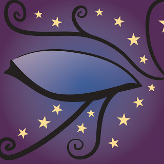
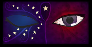
During the course of my research and sketching, I remembered my very cool Egyptian Book of the Dead. So I began playing around with the wedjat eye, the emblem for the falcon sky god, Horus. While the of of Horus doesn’t really a direction relation to dreams (the right eye is active/solar and the left eye is passive/lunar), I decided to develop my own two eyes that would be tied more closely to dreams for the covers. I also decided that if you were to put both the front and back cover together, the two eyes would be a complete illustration. I initially thought about doing the inside pages on vellum that were glued to the front cover and the the pupils on each eye would be cut out so you could see the image on the vellum backwards (like how our eyes capture images), however I soon realized that printing to vellum was not a good solution, it was going to be expensive, the ink didn’t seem to stick so well and the paper curled horribly, so to keep production sane (as I knew I’d be finishing up at the last minute), I stuck with my tried and true double sided paper for now. (I know, I know, I need to be more paper adventurous!)
The front cover eye is the nightmare eye and is wide open and bloodshot due to the lack of sleep from the nightmares. I used the color red here to convey, anger, madness, energy and unease. The swirl pattern reflects the wedjat eye, looking into the pupil into the nightmares that haunt this person. The burned in stars show the scars that the nightmares have left (see the inside front cover for more about this).
Then I realized I was only halfway done! My standard two zine pages have been side one: illustration, side two: poem tied to illustration. How in the world was I going to cram a poem and an illo together on the inside covers? I experimented with several placement options and decided to “book end” the poems: inside front cover would be on the left, inside back cover would be on the right. I decided to connect the inside cover pages too, so that they could be put next to each other as a diptych.
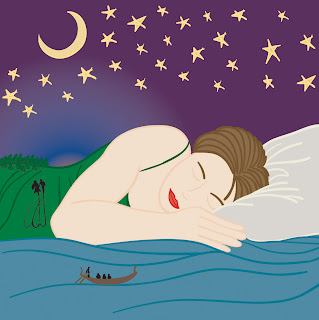
So I began work on the poems in between thumbnails for the front covers. The poems both seemed to come pretty easily while I was listening to my creative mix on iTunes,which was good, I could spend more time on the illustrations. The dreamscape illo was pretty easy: an image of a serene sleeper underneath the moonlit sky. I added in a few little dream elements: an Egyptian style boat, a couple in love, and a forest of trees that are ghosted into the image to hint at the fertile imagination of dreams.
The nightmare illo was a bit tougher. I had trouble finding the position of the dreamer for this one. And since I decided to mention Morpheus (Greek god of dreams) by name, how was I going to depict him/her? I drew a dude in a dark cloak, kinda a tribute to Neil Gaiman’s Sandman and felt that I could work with it once I got it into Illustrator and Photoshop.
Now that my sketches were done and I scanned them and placed them into Illustrator, where I went over them with the paintbrush tool. I used the paintbrush tool and my Wacom tablet to create a variable line width that mimics drawing by hand for the outlines. I then go back in and “fill in” flat color (as a separate layer under the outlines) using the pen tool. I tend to build my files with a lot of layers to the Photoshop end of things go a bit smoother. So I built the eyes (outside covers) first and they came together nicely.
I then worked on the dreamscape illustration and it came together quicker than I planned. Which means only one thing, the nightmare illustration gave me, well nightmares…
I created the dreamer first and then I worked on Morpheus. Morpheus looked horrible! I tried several variations and each one got progressively worse. And with each day ticking away, I knew that I didn’t have much time left to figure out how to render him. I decided to let the piece sit and I’d think about it for awhile. That did the trick, I realized that Morpheus did not have to appear as a person. Since I used the crescent (light) moon as the “protector” of dreams, why not use the “new (dark) moon” as the “tormentor”? And instead of a more traditional cloak, why not use those cool twisted stars from the front cover to make up the cloak? This idea worked out extremely well. The stars have nice jagged edges and when I put them into the shape of the cloak, they had the appearance of either being painful and/or bugs crawling across the dreamer’s skin.
Now for the type. I originally wanted to have a cool ambigram for the front cover done by my talented friend Nikita. Alas, due to time constraints, it just was not possible. So I went with plan B: I winged it. I had already chosen two different typefaces for each poem. I tried a few different fonts for the title and eventually settled on my old friend Zapfino, which I blurred a tinted a bit, like a dream coming into focus. I then looked at the type for the poems and decided that it would be best to use the same typeface for both poems and use color to distinguish the nightmare from the dreamscape. I then brushed in white behind the type to resemble “clouds” or comic book style “dream bubbles” on each poem to maximize the illustration as well as tie in the type.
That’s basically it, thanks for taking the time to read through this, and if you have any questions, just ask!


I don’t know what I enjoy seeing more; the sketches of the in progress work or the finished piece. Your illustrations are anything but simple. They say (whoever ‘they’ implies) that the best work, which takes the most time to execute and is very difficult in reality, looks deceptively simple. If that’s any indication, then your work is great! Keep it up Nick! Can’t wait to see what you have planned for HZ13!