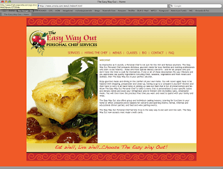
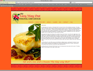
I’ve just completed a redesign of The Easy Way Out website. The Easy Way out is a locally owned and operated personal chef service that caters to families and busy professionals. The previous site was not getting updated and did not have the structure necessary to accommodate new offerings such as the classes she teaches. Since the chef’s specialty is Latin American cuisine, I kept the color palette warm and drew the pattern by hand in illustrator to give a more authentic Latin American feel to the site.
I kept the design simple and clean to showcase large photos of the chef’s beautiful recipes. Although I disagree with the decision to choose the same red as the top and bottom friezes as well as the decision to remove the black border that would have distinguished the background from the active site area, I think the resulting site turned out very well. The chef is very pleased with the redesign; she felt that we successfully achieved the objectives outlined in the creative brief.
Below is a screengrab of my preferred version, visit www.theeasywayout.net to see the live site.


