“HOWiezine is a limited edition, handmade collaborative book project created by HOW forum members, also known as HOWies. There is a theme and participants create two pages based on their interpretation of that theme. Only participants are eligible to receive a copy of the HOWiezine, and when they’re gone, they’re gone.” (quoted from www.howiezine.com)
As soon as I saw the theme for this zine, I knew what I would be doing. In 2002, I had written a poem about a bird that had acrophobia (I have it too, the poem was cheaper than therapy). And that vision was still strong in my head, so I had to illustrate it for this issue.
I also wanted to do more of a “sketchy” style that is truer to my pencil on paper thumbnail images. I felt this would convey a bit of the nervous energy that usually accompanies any particular phobia.
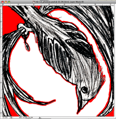
I tried a few different thumbnails before finding one that seemed appropriate and conveyed the idea of being acrophobic. I created the bird and tree separately from the background, as I wasn’t sure at this point how I wanted to do the background.
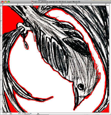
Once I scanned in the bird and tree part, I masked out the white areas where the background would show through on the final image. I then scanned the background image and then started to add color. The original plan was to simply give the image a watercolor look with my pencil sketch overlaid to define the outlines.
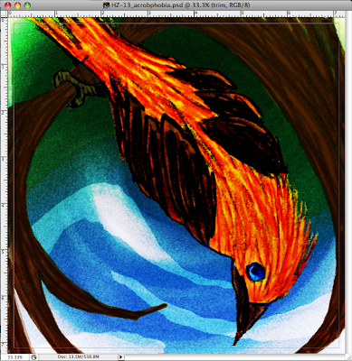
As I started laying in the color, I quickly found that the image in my head of a light watercolor/wash with pencil-like outlines was not going to cut it. So I amped things up a bit and tried various blend modes until the pencil lines blended into the colors better and it appeared more oil painterly. I did short, quick strokes with my Wacom to convey the energy and heightened nervousness usually associated with phobias.
I originally tried the background blurred and upside down. And I was content to leave it as that. But as the image progressed, and as I found a way to create a beautiful grainy texture that worked well with the image, it ruined the blur. So I thought about what it was like to be up high and how dizzy one feels when they are acrophobic and they are high up. So I started experimenting with how I could “swirl” the background like a person with vertigo.
For the poem side, I gave the background from the first page a watercolor look and added the bird flying away. I keep the text simple and solid, grounded if you will. For the title decided to put “phobia” lower (on the ground) than “acro” (up in the air).
I intended to give more of a perception of depth between the background the foreground, however as time grew short and I was not coming up with the answer, I had to leave it be. I’m not sure now that I look back that I’m completely happy with the end result. I feel that I could have done more to convey depth/height within the image that would have give people more of a feeling of what it is like to be acrophobic.
I am pleased with how the “sketchy” look turned out and I believe that I will explore this aspect of my style to see where it can lead…
For your viewing pleasure, the final images are below. And if you like what you see, you can purchase them over at imagekind.


