There’s been quite a lot of discussion on the new direction Pepsi took with their latest rebranding. Most designers seem to think it is a step backwards and just generally don’t care for it. Well, I’m going to respectfully disagree.
Pepsi’s former branding was looking very dated, busy, and definitely in need of a refresh:
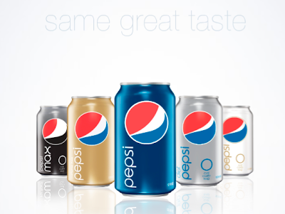
Pepsi cleaned up their design act for something much more crisp and clean:
And I for one, like it very much. It has a classic art deco feel to it: clean, elegant, timeless. Transforming the ugly globe (which I never liked anyway) into something reminiscent of an art deco icon was great, and then to alter the size of the white stripe depending on the product was brilliant! Combined with the simple solid color and the smooth type treatment, I have a feeling that these cans will become “classics” in due time. I think most folks are just so shocked by the change that they reacted before really taking a moment to truly appreciate the beauty of the new design.


I’m inclined to agree with you. Other than the right side of the “smile” being a bit too tightly closed to my eye. I think this looks great.
I find this adds more movement to the globe.