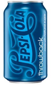
I saw this Brandweek post talking about Pepsi’s new “all-natural” soda as well as their “throwback” formulas coming to stores April 20.
The packaging is nice, simple, and clean for both designs. What really caught my attention was the Pepsi throwback design:
While I’m a fan of the new “regular” Pepsi rebranding, I know that many people are not. Perhaps if outcry is strong enough, Pepsi should just go to selling the “throwback” formula as the “regular” Pepsi and ditch the other branding in favor of this one. (I’m in favor of keeping the old formula anyway, as it has less crap ingredients in it).
I love how simple and elegant this throwback design is. Plus, it really honors the long legacy of the brand respectfully. Well done!


