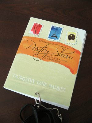
Last week was the fifth annual Dorothy Lane Market Pastry Show. This marks the second year that we’ve done a “book” for the show that features write-ups about the fine pastries, hors d’oeuvres, and beer and wine offered at the event. The book acts as an admission badge and event souvenir.
For this year’s theme, I decided to go with “spring watercolors postcards” when I was developing the design for the advertising materials. I had found some awesome watercolor brushes for Illustrator that I was itching to try out, so I played with various combinations of strokes until I achieved that Impressionistic watercolor look that I had envisioned. I then turned the icons for the Eiffel Tower, pastry, and tulip that I’d used in previous years’ materials into stamps to tie everything together.
I was surpised by the strong response by our associates to the finished piece: they all just fell in love with the simple design. It is quite a departure from previous years and from all the positive reactions I’ve heard, a good one at that! To steal a line from the A-Team: “I love it when a good design comes together.” 🙂
©Dorothy Lane Market. Used with permission


