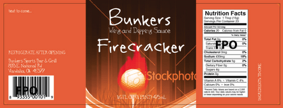
Wow, it’s been a busy year for me. So busy that I forgot to post several cool projects that I completed this year. Here’s one of them…
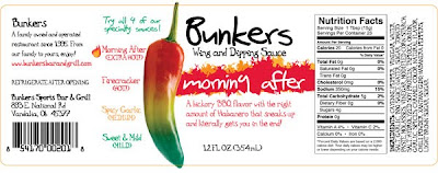
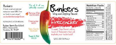
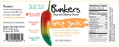
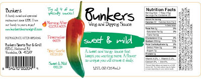
I completed this label design for Bunker’s Bar & Grill, a local sports bar earlier this year.
The client had a couple of requests: they’d like a sports theme if possible and they really wanted to do a pepper that showed a heat scale for each of their sauces.
I started out with the sports theme, but it just wasn’t giving off the right vibe. Plus the addition of a pepper graphic was not working out well…

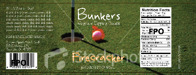
So I worked on a simpler version that focused more on the pepper heat scale…
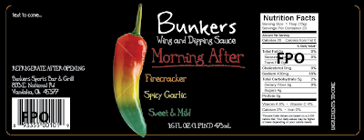
The client preferred this direction much better, but wanted a cleaner look to the label. After the client’s suggestion of using white, I needed to figure out how to make the flavor name stand out more. I tried several variations and decided to give each flavor its own style of brushstroke along with a unique color that related to the heat scale imagery.
The client loved it and these are the final labels…
