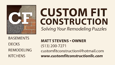
This was my first-ever barter project. My friend started his own construction business, Custom Fit Construction after being downsized in the economic downturn. He and his wife had developed a tagline and had a starter logo to get them off the ground, but wanted something a bit more clean and crisp as he expands his business and looks for a larger customer base.
I happened to need a new patio, so we worked out an agreement and work began just as the weather turned cold at the end of 2010. Alas, my long-desired patio would have to wait until Spring, but that’s okay, I could still work on the logo in the meantime…
The original concept for his logo was “Solving Your Remodeling Puzzles” and they wanted to stick with that, so I used that as my basis and went to work and developed four concepts. I mocked up the logo in a business card format to help the client visualize the final outcome and help speed up development time.
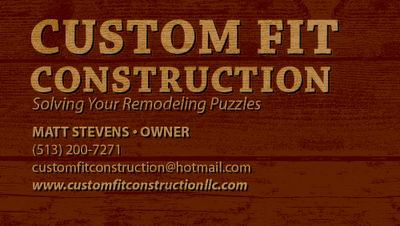
Version A: standard “wood” version to imply the basis of nearly all construction. Cliché, but hey, gotta get it out of your system, plus you can’t go wrong with an awesome background texture:
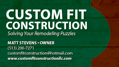
Version B: I kept the wood texture (from my friend Von’s book: Crumble. Crackle. Burn. Great resource for any designer!) and added a puzzle element in keeping with the company’s tagline:
Version C: I custom fit each letter of the words “Custom Fit Construction” together like puzzle pieces:
Version D: I developed a more puzzle look for the logo while keeping the type clean and crisp. For the background I took photos of wood, concrete, brick, floor tile and gravel all around my house one sunny Saturday in November:
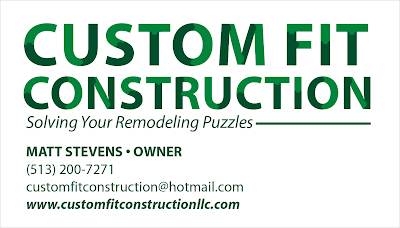
My friends really liked version D, but wanted it to be a bit cleaner looking so I made the the background white and changed the type to the green from version C to reflect that he does do green construction too.
I reworked the textures a bit for the final version as seen here:
So far my friend really likes the new logo and looks forward to implementing it across all media.
