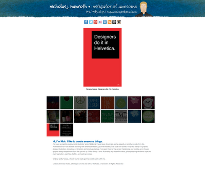
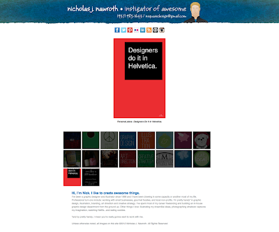
The last time I redesign my website was 2008, and I had been meaning to update the design since about 2010, but client projects and a very full schedule have kept it on my to-do list until this year. While not a complete redesign of the site structure, I have changed a lot.
My new title is Instigator of Awesome! to demonstrate that not only do I do graphic design, but design consulting and art direction. It also conveys a sense of my personality better. I switched from the formal Futura to a casual script typeface, JB Bruno, for a more approachable feel. I ditched the heavy dark blue background for white to brighten up the whole site.
I moved my social media and website icons up to the top of the page so that folks could choose to view my portfolio or view my other website info first. I enlisted the help of my friend Annie, owner of the awesome stationery store, The Envelope, to clean up my bio and make it friendlier.
I also tweaked my self portrait illustration: softened a few lines here and there and made my smile a bit happier. I removed the geometric art deco background and replaced it with a watercolored textured background for a more hand-crafted feeling.
While I had intended to make additional pages and a place to sell my prints on this version of my site, I decided to leave it as is for now. This refresh was very refreshing and maybe on version 2012.2 I will incorporate some of my more grand ideas…


Looks nice!
Thanks! 😀