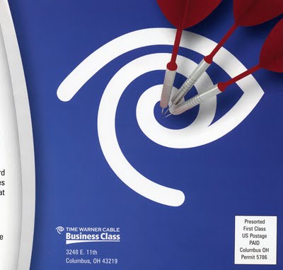
A buddy at work received a mailer from Time Warner Cable’s business service. I couldn’t help but notice their main image:
Uh, say what? Using your EYEBALL logo as a bullseye? What genius came up with this one?! What are they trying to say here: using TWC will making you want to poke your eyes out?
Major FAIL here, Time Warner, I hope that whomever came up with this one got sent back to design school…


