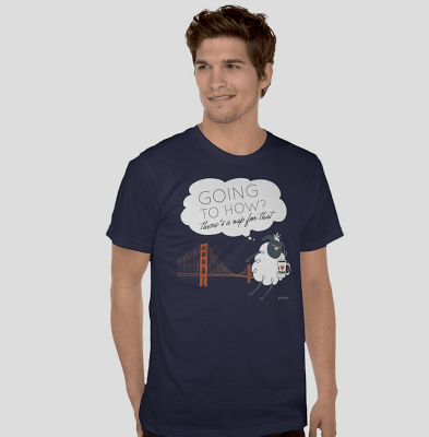
HOW or knowHOW, there’s a Nap for That!

For those designers fortunate enough to be attending this year’s HOW Design Live event in San Francisco, there is a Nap for That! As a veteran HOW conference attendee, I can assure the noobs, that I’m not kidding. And to prove it I designed a custom Nap for That tee just for this year’s conference. … Read more HOW or knowHOW, there’s a Nap for That!

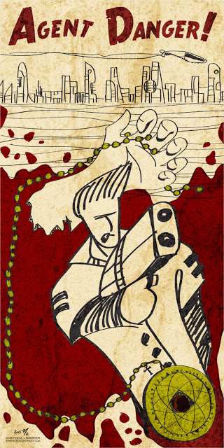
New Work: Agent Danger!

I’ve had the concept of Agent Danger! in my head since my college days. The concept was simple: a futuristic Blade Runner/Secret Agent main character that solved gritty and strange mysteries. I would tell the stories in comic book style, but not using the traditional comic book dimensions. For the 2013 version, I decided to … Read more New Work: Agent Danger!

My original art for sale at DVAC’s Art to Buy!

Over the summer, I decided to join DVAC (Dayton Visual Arts Center) as an outlet for the mounting collection of personal work I’ve been doing. I joined just in time for the annual member’s show. This year’s theme was No Borders, so my Dream Pig image seemed a natural fit. After a successful show (it … Read more My original art for sale at DVAC’s Art to Buy!

Nap for That Rebranded!

Not long after Apple began it’s “There’s an app for that” advertising campaign, I was inspired to begin my Nap for That t-shirt line not only in jest, but also because I’m serious about napping. Just ask any of my friends, it’s true.  While the clean and simple typography was easy to work with, it … Read more Nap for That Rebranded!

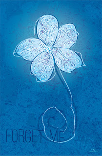
Forget Me (not)

My dad, Harry O. Nawroth, was diagnosed with Alzheimer’s Disease in the final years of his life. He lost his fight last year on this date at the age of 83. Some days he had good days, some days not so good. But deep down inside, my dad was in there. I’m glad that he’s … Read more Forget Me (not)

Life Sucks Then You Fly

I’m having fun with a new series of posters that I developed at the end of 2011 and 2012 that started with Dream Pig and Give Peas A Chance. I love the simple iconography and type combined with a single, strong color for a quick, compelling story. I’ve tried to keep the feeling light and airy throughout. I … Read more Life Sucks Then You Fly